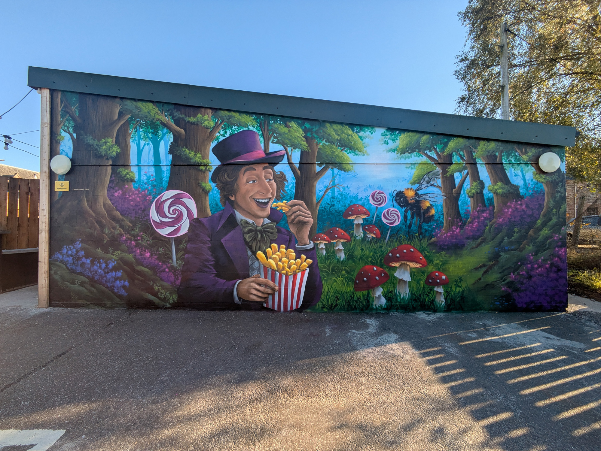
A vibrant new piece of public art has been unveiled at The Tarradale Chippy in Muir of Ord, marking the latest installation in Mikeysline’s ongoing campaign to spark conversations about mental health and suicide prevention.
The charity commissioned artist Marc Delaye, of Fresh Paint, to create this eye-catching mural as a highly visible reminder of the support services they offer across the North of Scotland.
The artwork itself is an engaging and whimsical scene. It features a character strongly resembling Willy Wonka, who, in a playful twist, is happily enjoying a large bucket of french fries (chips) instead of a sweet treat. The figure, dressed in the iconic purple jacket and top hat, stands within a fantastical setting: a deep forest with gnarled, twisting trees, vibrant purple and pink foliage, oversized lollipops, and bright red and white toadstools, all beneath a bright blue sky. Adding to the fantasy is a large, realistic-looking bumblebee hovering on the right side.
This Muir of Ord mural is the newest addition to an expanding collection of artworks designed by Fresh Paint to highlight Mikeysline’s presence and availability throughout the region. Previous murals are already visible in prominent locations, including Inverness, Wick, and Thurso. Earlier this year, a similar piece featuring Scottish singer Callum Beattie was installed in the Inverness Victorian Market, further promoting the charity’s mission.
Mikeysline has established itself as a vital resource for residents across the Highlands, Islands, and Moray. The organisation is dedicated to dismantling the stigma surrounding mental health by promoting open and honest conversations with anyone experiencing emotional distress.
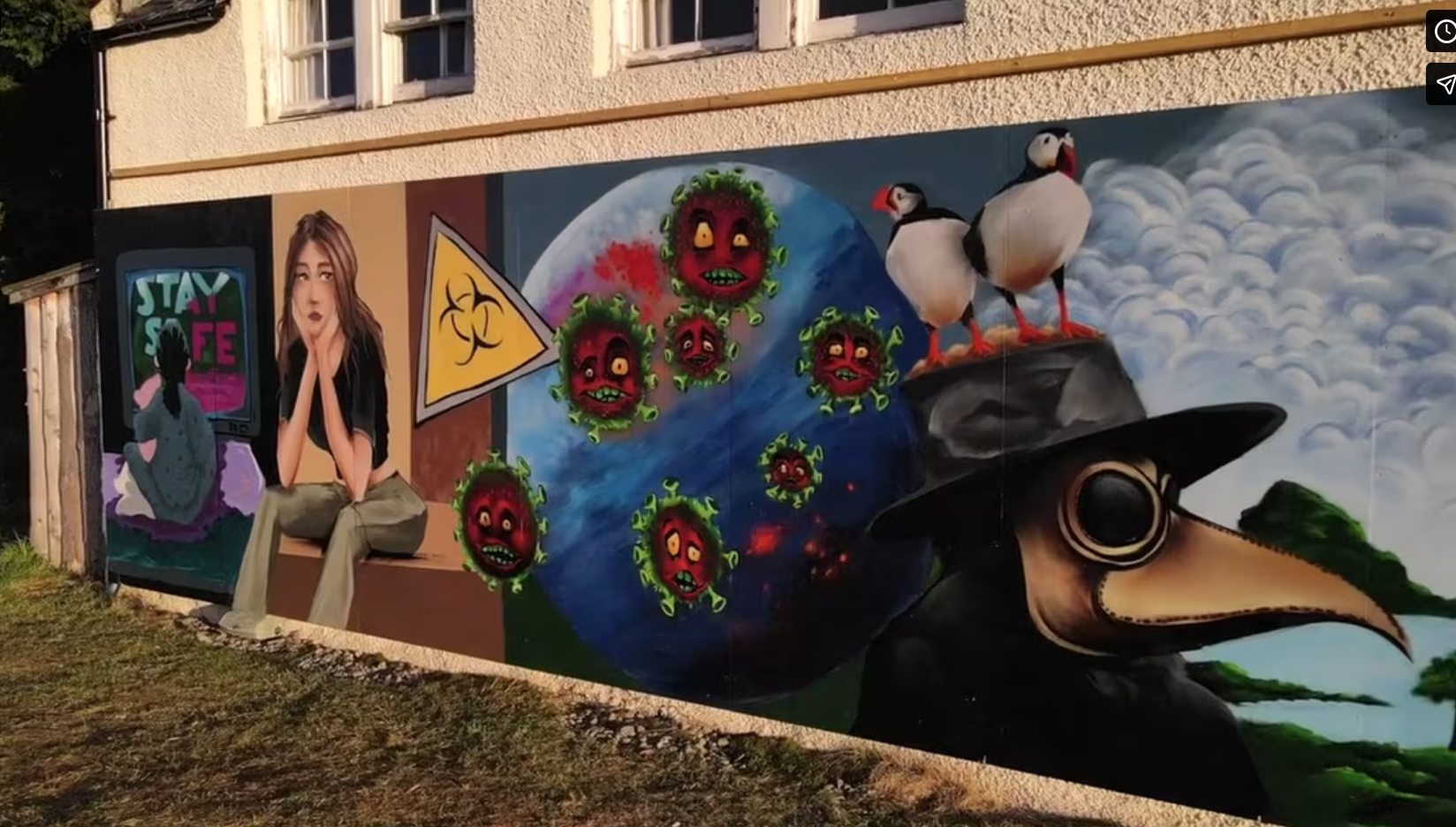
2020 was a particularly challenging year for young people and we were delighted that we were able to bring small groups together within the youthwork guidance framework to rebuild social connections within a dynamic and creative environment. If Streets Could Talk – In October a small group worked with writer Alan Bissett to articulate what it was like to be a care experienced young Scot in 2020. They then developed their thoughts and ideas into images and spent two days, in the driving rain and wind, with street artist Marc Delaye of Freshpaint to create a striking 10 metre mural.
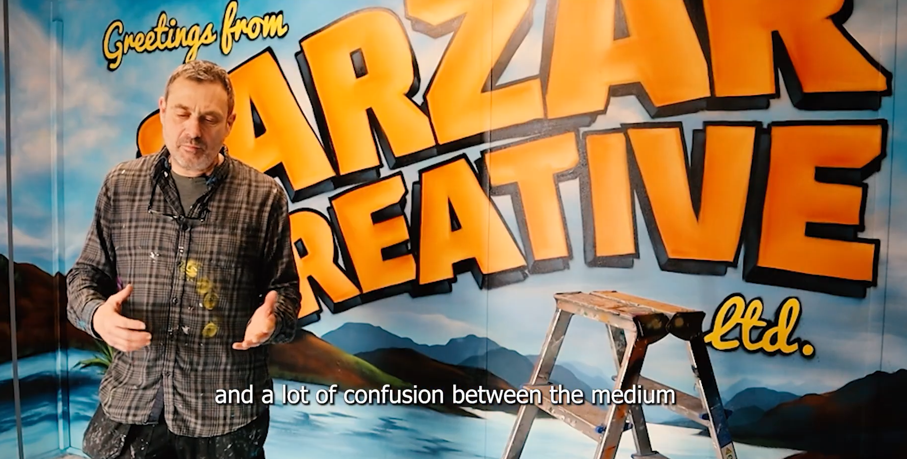
I’m Marc Delaye and I run Freshpaint.org Fresh Paint is about commissioned murals, people come with their ideas and I try to paint their Vision. I’ve I’ve kind of always done it, I started in the in the late uh late 80s, I was supposed to stop, then I just carried on because there was a demand up here in the highlands. Like we said earlier graffiti is a bit like a black eye to the culture, when you say the word graffiti because it’s it’s an umbrella term that also refers to the people writing on graves, racist graffiti …what I’m doing is nothing to do with that . I think there is a it’s always been a lot of wrong perception around the artform and a lot of confusion between the medium and the style of the painting. The perception has changed, some things have changed some haven’t, I think a lot of businesses started to uh to target some young, from a sign point of view which is more what we did here like a signage, it’s the old school way to do it, it’s full of imperfections and I think that’s what makes it connects with people You can see at the moment like a lot of those young dudes in America going on the sides of buildings painting those vertical lettering like 30 m, 50 m high, but I’m too old for that.
CAUTION: This activity requires investing time and effort to practice and refine.
🛠️ Materials Needed
A4 paper, pencil, rubber, chisel point marker pen, thin black pen, and a good selection of color pens.
DOCUMENTATION
I would start this workshop the same way I start any workshop session. I would commence with a lot of pictures to look at. That definitely helps for inspiration.
It’s important to spend time browsing, just to make sure we are talking about the same thing.
CHOOSE A WORD
Try to think about a word, less than 5 letters works well on A4 sheet of paper.
Avoid to write a phrase as it’s quite hard to keep the flow (unity or consistency between the letters).
It can be any words, anything really, if you haven’t got a clue here is a list to help you:
A name, a nickname, or a pet’s name is considered. It also can be a band or a football team. Think about a color, a sister’s or brother’s name, or a boyfriend’s or girlfriend’s name. It even can be a car, an animal, or a city. It should be anything that makes sense for you.
Try to avoid using graffiti writers’ names already in use. You can easily check this at Art Crimes, the worldwide database.
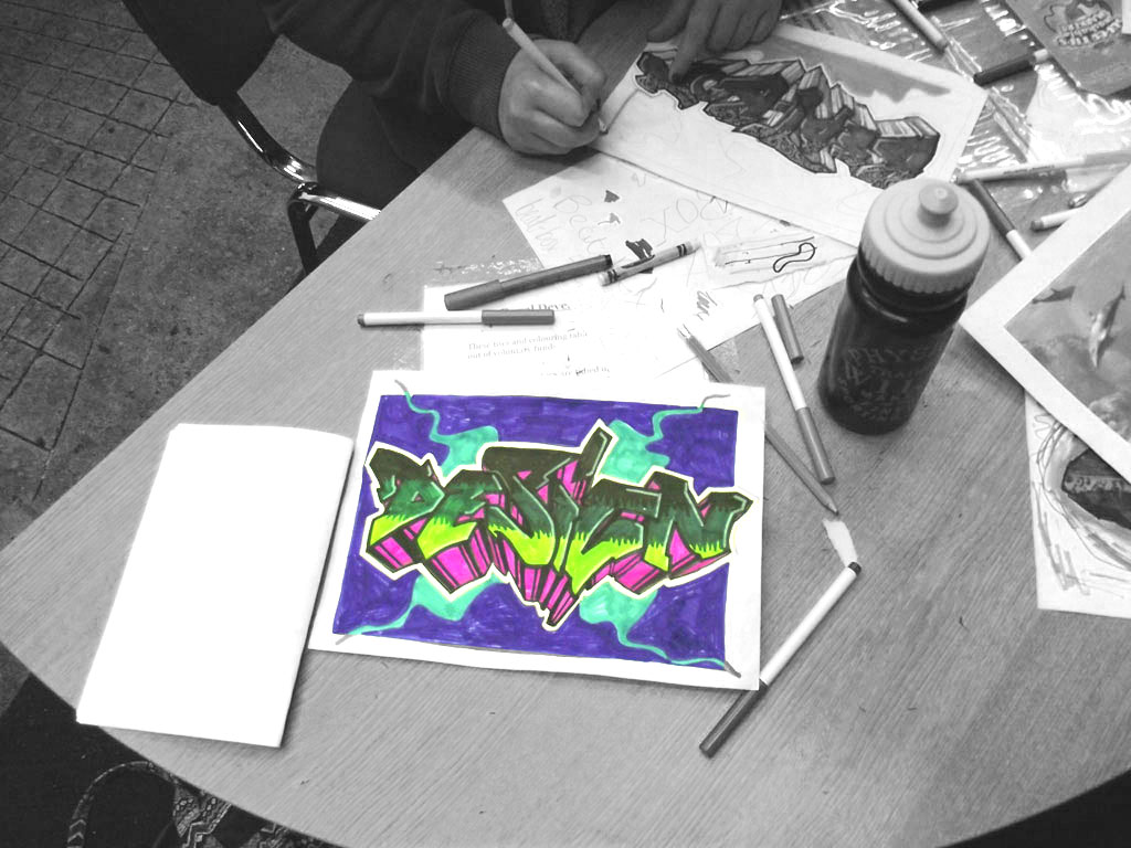
Write with your own handwriting the chosen words in the corner of the page.
This exercise is based on style and speed.Don’t try to sketch,remember you’re writing.
Give different variations of the word you’ve chosen in step 2, you need to be productive.
Here is a list of things to try. You can alternate capital and small letters. Start small and finish big. Add nice dynamics. Use italic style. Try cursive style. It doesn’t matter how you do it but you need to get movement,and get the letters to 2 “dance”.
Also if you’re using a chisel marker pen, experiment with the chisel point horizontal, vertical, 45 degree angle.
Use the tag Alphabet if needed.
After you’ve filled up a few pages, gather them. Step back and choose the tag you feel is the best. Use a thin black pen to outline it, leaving a few millimeters of white between the tag and the outline.That’s gonna be the base, the structure of your piece.
It’s time for a good tidy up. Get rid of those pages covered with tags. Only keep the final outlined tag. You can make a frame and fold the paper so you focus on the final tag.
GUIDE LINES/ BARS
The guidelines are gonna be used to keep your letters accurate, and they are just constructions lines (double lines).
We are gonna used 2 types, straight parallels and bent parallels.
The next step is to follow the letter structure of the tag, and redo it with those parallel lines. It’s important to keep a good consistency, same width between the parallel lines.
Try to get some nice chunky letters (if the parallel are too narrow you won’t be able to add effects in them), add some arrows, jump off, you can get the letters to overlap each
other, break some angles, get the corner slightly rounded, make sure you keep a good flow (consistency,unity)between the letters..
This part of the sketching process is a real science. Check out the exchange website for inspiration and clever comments. It provides insights regarding the process of making a graffiti piece.
outline your lettering and rub off the construction lines.
COLORS
Colors are like music notes. You will need a few of them to get harmony. Mixing the wrong ones together will yield a painful result.
There are some classic combinations that work quite well. One example is using warm colors in the background. Cold ones can be used for your graffiti piece.
Try not to use the same color in the fill and the 3D. Using the same color in the background might just be confusing.
A good strategy is to use primary colors (yellow, red, blue) as a base for your color choice. For example, use fill yellow, 3d blue, and background red.
Complementary colors (yellow/violet, green/red, blue/orange)works well to get a maximum contrast.
For color scheme inspiration check out the color lovers website.
THE FILL
We’re gonna draw 2 horizontal lines and divide the piece in 3 parts .
Start coloring in each part with 3 different colors, colors from the same range works well, IE: white, yellow, orange.
Then blend in each part with the darker color that you’ve used , IE: orange on the yellow,and yellow on the white
You can use any patterns, i usually use bubbles, as it’s easy to do but any patterns would do (strokes, square…)
EFFECTS
It’s time to add a few effects to the lettering.Don’t overdo it.Just enough to spice up the piece a bit.
If you’ve used orange, yellow and white for the fill some random red effects would work pretty well.
Here is a list of the most popular graffiti effects : stars, bubbles, wave effects, chip effects, skyline, wall cracks, strokes, stripes, highlights, light shine effects…
3D
There are different ways to get the 3D right. The proper way is to establish a vanishing point. Draw lines from every angle to reach that point. Then choose a width for your 3D. Next, determine the parallel of the letter. Ensure the 3D maintains the same width throughout the piece.
Another way is to choose a direction: up, down, right, or left. Use horizontal or vertical straight lines. Then choose the width. Finally, make it parallel to the letter. (this way is much easier)
Color in the 3D with a light color. This will allow you to add a few stripes on it with a darker color. Create a rectangle, then color it in. Add a line at the top, then at the middle, and finally at the bottom of the 3D. That effect will give more strength to the volumes.
THE FORCE FIELD
The force field is an outside outline,between the piece and the background.
The same way we did the outline at the beginning on the tag.Try to leave some white.
THE BACKGROUND
Background is used to make the piece stand out from the piece,( the color or design painted behind the piece to make it stand out.)
Don’t neglect it, it shouldn’t be too overpowering either.
Here is a list of background design that you can use to enhance your lettering: simple frame, lines with different thickness, bubbles, wall cracks, splashes of paint, clouds…
You can also download a vehicle template for use in your graffiti sketches, like this:


