Online graffiti workshop
Workshop for kids 12+
This online workshop will guide you step by step to realize a colorful piece.
Materials needed: A4 paper, pencil, rubber, chisel point marker pen, thin black pen and a good selection of colour pens.
::CAUTION ::This activity requires investing time and effort to practice.
DOCUMENTATION
I would start this workshop the same way i would start any workshop session, with a lot of pictures to look at, that definitely helps for inspiration.
I usually use magazines, here on the internet i would suggest the Flickr public group GRAFFITI=LETTERS.
Try to focus on the letters and try to read them also try to recognize all the different elements that compose a piece:
-The letter structure(the shape of the letters, simple block letters, semi wild style, wild style, 3D style, west coast style, bubble style…)
-The fill (gradient fill top to bottom…)
-The effects (wave effects, bubbles, splashes, cracks, chip …)
– The outlines(thick, thin..)
-The 3D (straight 3d, up, down, left, right, using vanishing point, work on the volumes…)
-The background(minimalist, busy, abstract, dirty grunge…)
It’s important to spend a bit of time browsing, just to make sure we are talking about the same thing.
CHOOSE A WORD
Try to think about a word, less than 5 letters works well on A4 sheet of paper.
Avoid to write a phrase as it’s quite hard to keep the flow (unity or consistency between the letters).
It can be any words, anything really, if you haven’t got a clue here is a list to help you:
a name, a nickname, a pet’s name, a band, a football team, a color, a sister’s name, a brother’s name, a boyfriend’s name, a girlfriend’s name, a car , an animal, a city,…anything that makes sense for you.
Try to avoid using graffiti writers names already in use , you can easily check out at Art Crimes the worldwide database.
Write with your own handwriting the chosen words in the corner of the page.
HAND STYLE/GRAFFITI TAG

This exercise is based on style and speed.Don’t try to sketch,remember you’re writing.
Give different variations of the word you’ve chosen in step 2, you need to be productive.
Here is list of things to try: alternate capital / small letters, start small finish big, add nice dynamics, italic style, cursive style..it doesn’t matter how you do it but you need to get movement,and get the letters to 2 “dance”.
Also if you’re using a chisel marker pen, experiment with the chisel point horizontal, vertical, 45 degree angle.
Use the tag Alphabet if needed.

After you’ve filled up a few pages, gather them, get a step back and choose the tag that you feel like the best, and with a thin black pen outline it , leaving a few millimeters of white between the tag and the outline.That’s gonna be the base , the structure of your piece.
It’s time for a good tidy up, get rid of of those pages covered of tags and only keep the final outlined tag, you can make a frame and fold the paper so you focus on the final tag.

GUIDE LINES/ BARS
The guidelines are gonna be used to keep your letters accurate, and they are just constructions lines (double lines).
We are gonna used 2 types, straight parallels and bent parallels.

The next step is to follow the letter structure of the tag, and redo it with those parallel lines. It’s important to keep a good consistency, same width between the parallel lines.

Try to get some nice chunky letters (if the parallel are too narrow you won’t be able to add effects in them), add some arrows, jump off, you can get the letters to overlap each
other, break some angles, get the corner slightly rounded, make sure you keep a good flow (consistency,unity)between the letters..

This part of the sketching process is a real science, check out the exchange website for inspiration and clever comments regarding the process of making a graffiti piece.
outline your lettering and rub off the construction lines.

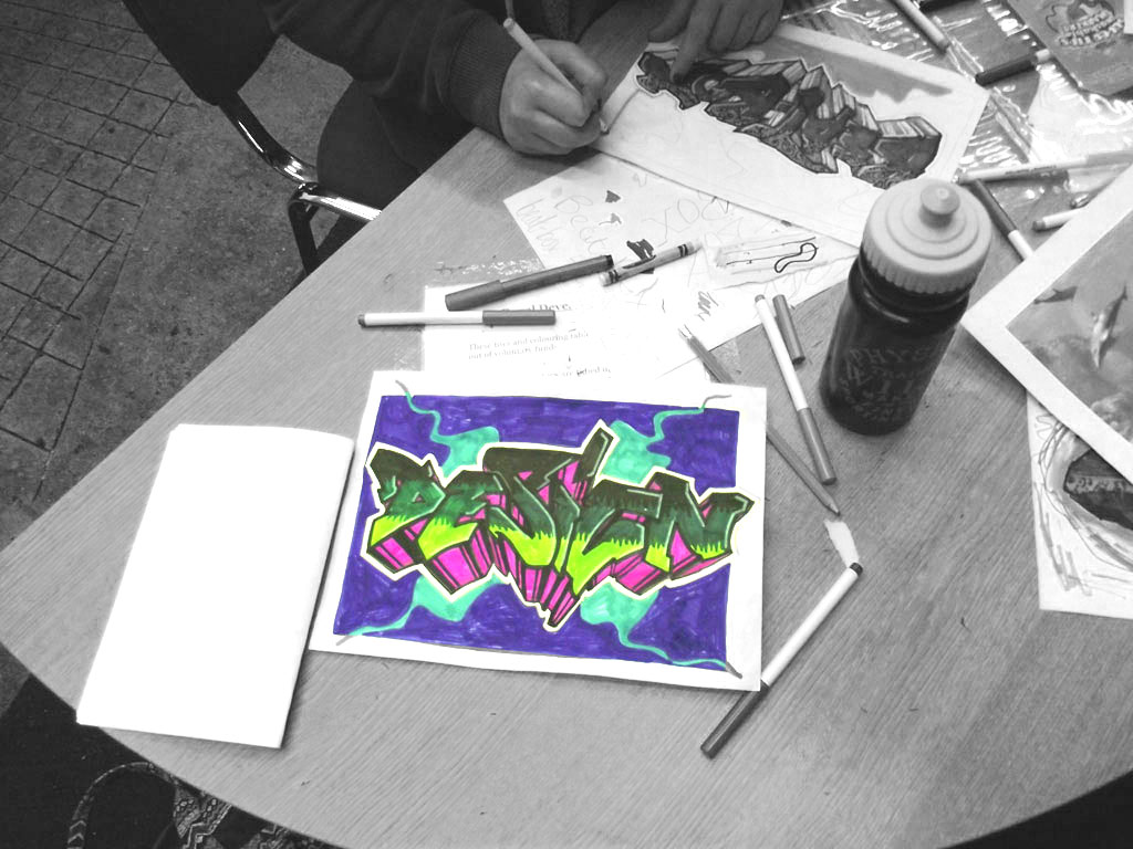
COLORS

Colors are like music notes , you will need a few of them to get harmony, if you mix the wrong ones together you will get a painful result.
There are some classic combinations that work quite well like using warm colors in the background and cold ones for your graffiti piece .
Try not to use the same color in the fill and the 3d and the background that might just be confusing.
A good thing to do is to use primary colors (yellow, red, blue) as a base for your color choice , IE: fill yellow, 3d blue, background red.
Complementary colors (yellow/violet, green/red, blue/orange)works well to get a maximum contrast.
For colour inspiration check out the Colour lovers website, where you will find everything you need to know about colors, their meanings and the color combinations.
THE FILL

We’re gonna draw 2 horizontal lines and divide the piece in 3 parts .

Start coloring in each part with 3 different colors, colors from the same range works well, IE: white, yellow, orange.

Then blend in each part with the darker color that you’ve used , IE: orange on the yellow,and yellow on the white
You can use any patterns, i usually use bubbles, as it’s easy to do but any patterns would do (strokes, square…)
EFFECTS
It’s time to add a few effects to the lettering, not to much, just enough to spice up the piece a bit.

If you’ve used orange, yellow and white for the fill some random red effects would work pretty well.
Here is a list of the most popular graffiti effects : stars, bubbles, wave effects, chip effects, skyline, wall cracks, strokes, stripes, highlights, light shine effects…
3D

There are different ways to get the 3D right.The proper way is to do a vanishing point , and draw some lines from every angles to reach the point,then choose a width for your 3D , then get the parallel of the letter, make sure the 3D got the same width all the way through the piece.

Another way is to choose a direction, up, down, right, left,with horizontal or vertical straight lines,then again choose the width,then parallel to the letter.(this way is much easier)
Color in the 3D with a light color so you will be able to add a few stripes on it with a darker color , a rectangle that you colors in then a line, at the top, at the middle, then at the bottom of the 3D.That effect will give more strengh to the volumes.

THE FORCE FIELD
The force field is an outside outline,between the piece and the background.
The same way we did the outline at the beginning on the tag.Try to leave some white.

THE BACKGROUND
Background is used to make the piece stand out from the piece,( the color or design painted behind the piece to make it stand out.)
Don’t neglect it, it shouldn’t be too overpowering either.
Here is a list of background design that you can use to enhance your lettering: simple frame, lines with different thickness, bubbles, wall cracks, splashes of paint, clouds…
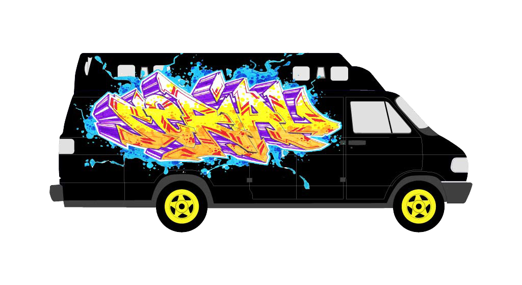
You can also download a vehicle template for use in your graffiti sketches, like this:


ET VOILA! © FRESH PAINT
Love your site. I’m teaching HS art, going to use it for my class.
Thanks Dawn, please let me know how did you get on with the graffiti workshop.
I’ve been searching in google for some new ideas and occasionally found your freshpaint.org website.
I have to say that it’s a great blog! I admire how determined each of the entries are. They are well balanced – entertaining and informational – and the pictures are cool too.
cool website!
We’re a group of volunteers and opening a new scheme in our community. Your website provided us with useful information to paintings on. You have done a formidable process and our whole neighborhood might be grateful to you.
Hello very cool web site!! Man .. Excellent .. Superb .. I will bookmark your blog and take the feeds additionally…I am happy to find so many helpful information right here within the submit, we want work out extra techniques in this regard, thank you for sharing.
Pingback : Why People Are Attracted To Graffiti - Port Community Arts Centre