
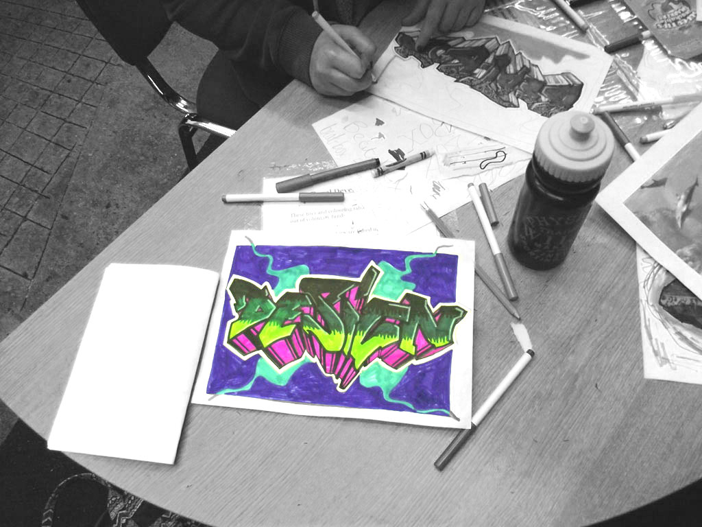
This step-by-step guide is a taste of what I cover in my graffiti workshops — perfect for kids and teens who want to have a go at home, and for art teachers looking for a structured lesson plan to try in the classroom. If you’d rather I run the session for you, I deliver workshops for schools, youth groups, and private bookings across Inverness and the Highlands.
Target Audience
- Kids 12+ and up
- CAUTION: This activity requires investing time and effort to practice and refine.
Materials Needed
A4 paper, pencil, rubber, chisel point marker pen, thin black pen, and a good selection of color pens.
DOCUMENTATION & INSPIRATION
To begin with, I start this workshop the same way I start any session. Specifically, I commence with a lot of pictures to look at because visual reference definitely helps for inspiration.
I usually use magazines during live sessions. However, here on the internet, I suggest checking out the Instagram public group SKETCH AND GRAFFITI.
First, try to focus on the letters and try to read them. Consequently, you will learn to recognize all the different elements that compose a finished piece:
– The letter structure (the shape of the letters, simple block letters, semi wild style, wild style, 3D style, west coast style, bubble style…)
– The fill (gradient fill top to bottom…)
– The effects (wave effects, bubbles, splashes, cracks, chips…)
– The outlines (thick, thin…)
– The 3D (straight 3d, up, down, left, right, using a vanishing point, working on volumes…)
– The background (minimalist, busy, abstract, dirty grunge…)
Overall, it’s important to spend time browsing first, just to make sure we are talking about the same thing.
CHOOSE A WORD
Next, try to think about a word to draw. Generally, choosing a word with less than 5 letters works best on an A4 sheet of paper.
However, avoid writing a full phrase, as it is quite hard to maintain letter flow (the unity and consistency between letters).
It can be any word at all. For instance, if you haven’t got a clue, here is a list of ideas to help you get started:
You can use a name, a nickname, or even a pet’s name. Alternatively, think about a band, a football team, a color, or a sibling’s name. In addition, an animal, a car, or a city can work great too. Choose anything that makes sense to you!
However, try to avoid using existing graffiti writers’ names. You can easily check names on Art Crimes, the worldwide database. Once chosen, write the word in your normal handwriting in the top corner of your page.
HAND STYLE & GRAFFITI TAG

This stage is based entirely on style and speed. Therefore, don’t try to sketch yet—remember that you are writing rapidly.
Exploring Letter Variations
Create many different variations of your chosen word. In short, you need to be productive! For example, you can alternate capital and small letters, or start small and finish big. In addition, try using an italic or cursive style to add dynamic movement.
Furthermore, if you are using a chisel marker pen, experiment with holding the chisel point horizontally, vertically, or at a 45-degree angle. You can also refer to the tag alphabet below if you need extra guidance.

Selecting Your Final Tag
After filling up a few pages, gather them together and step back. Next, choose the single tag you feel looks the best. Use a thin black pen to outline it, leaving a few millimeters of white space between the tag and the outline. Consequently, this will become the base and structural foundation of your piece.
Finally, it’s time for a good tidy-up. Get rid of the practice pages and keep only the final outlined tag. As a result, you will be able to focus completely on your main design.

GUIDE LINES & BARS
Guidelines are used to keep your letters accurate. Basically, these are just construction bars (double lines).
We are going to use two main types: straight parallel lines and bent parallel lines.

Building Chunky Letters
The next step is to follow the original letter structure of your tag and rebuild it using those parallel lines. Above all, maintain consistent spacing between the lines.

Try to draw nice chunky letters. Otherwise, if the parallels are too narrow, you won’t be able to add effects inside them later. For example, add arrows, let letters overlap, break sharp angles, or round off the corners.

This sketching step is a real science. For additional inspiration, check out the Exchange website. Finally, outline your new lettering cleanly and rub off the original construction lines.

CHOOSING YOUR COLORS

Colors are much like musical notes. Therefore, you need harmony between them because mixing the wrong ones will yield a messy result.
Color Combination Strategies
Fortunately, there are classic combinations that always work well. For instance, using warm colors in the background while keeping cool colors for the main letters creates great contrast.
However, try not to use the exact same color for both the fill and the 3D effect. Similarly, using that same shade in the background will cause confusion.
Another solid strategy is using primary colors (yellow, red, blue) as your base. For example, try a yellow fill, blue 3D, and a red background. In addition, complementary pairs (yellow/violet, green/red, blue/orange) work wonderfully for maximum contrast. You can also explore COLOURlovers for pre-made palettes.
THE FILL

First, draw two light horizontal lines across your letters to divide the piece into three distinct sections.

Next, begin coloring each section with three different shades. Choosing colors from the same tonal family works best—for example: white, yellow, and orange.

Then, blend the boundaries using the darker shade from the adjacent section (e.g., orange strokes over yellow, and yellow over white). Finally, feel free to add fill patterns like bubbles or simple geometric strokes.
EFFECTS
Now it’s time to add extra effects inside your lettering. However, remember not to overdo it! You only need just enough detail to spice up the artwork.

For instance, if you used orange, yellow, and white in the fill, adding bright red details will pop nicely. Popular effects include stars, bubbles, wave lines, chip cracks, skylines, and light highlights.
ADDING THE 3D EFFECT
Methods for Creating Depth
There are two main ways to establish your 3D depth correctly. First, you can set a vanishing point. Draw straight projection lines from every corner toward that point. Then, set a fixed thickness and draw lines parallel to your letters.

Alternatively, you can choose a single direction: up, down, left, or right. Simply drop diagonal lines off every corner in that direction and connect them. Consequently, this second method is much easier for beginners!
Shading and Details
Color in the 3D block with a light base color. Afterwards, you can add inner detail lines using a darker shade. For example, adding horizontal stripes at the top, middle, and bottom of the 3D block will give your letters far greater volume.

THE FORCE FIELD
The force field is an outer outline placed between your artwork and the background.
Draw this boundary similarly to how you made the tag outline earlier. As a result, leaving a small margin of white space will help isolate your letters from the background details.

THE BACKGROUND
The main purpose of the background is to make your piece pop off the page. However, while it should enhance your piece, it shouldn’t be overly intense or distracting.
For example, you can use simple frame borders, varied stroke lines, paint splashes, bubbles, or clouds. In addition, you can even draw your piece on top of a vehicle template, such as those below:


ET VOILA! © FRESH PAINT
I offer full workshop sessions across the Highlands, built around exactly this kind of step-by-step process, scaled to the group’s age and time available. Art teachers: get in touch about booking a session, and I can tailor the materials list and pacing to fit a lesson period. Get in Touch →